The direction of the clock..
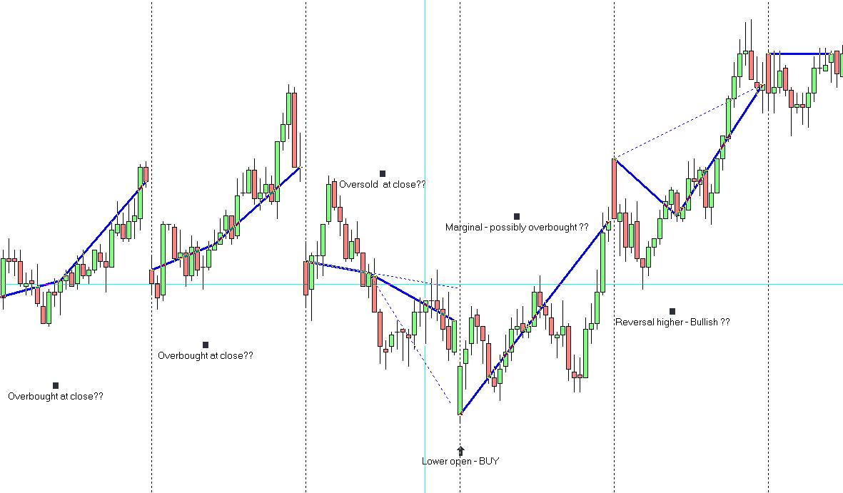
Being distrustful of indicators - or just plain lazy - I'm always looking at new ways to see and simplify things. The image below shows my attempt to graph price action. The first blue line connects the open (9.30 EST) to the close (12.30 EST) and the second blue line connects the close (12.30 EST) to the RTH close (4.15 EST).
I've found this to be a useful division of trading hours - don't ask why ;-)
The theory is that the slope of the second line in relationship to the first line indicates whether price closed in an over or under bought/sold condition. Not shown in the image below is an under bought/sold condition but if you can imagine the fourth day (buy signal shown) as the hands on a clock and if they showed 7.10 as opposed to 7.05 then we'd consider that price closed in an underbought condition and we'd be looking at buying lower.
I've not done any backtesting on this idea - only using data from this year - but when price opened up below the previous days range from an oversold condition (and vice versa) then there was a 30% chance of a significant 2 day price reversal. Maybe the Taylor guys can explain this.
A word of warning - not every week is nearly as pretty as the example shown - but, sometimes I remove the candlesticks off the chart and just look at the blue lines to get a feel for the bigger picture.
So whaddya fink...have I been looking at too many charts or can someone else see something useful in all of this??
Click image for original size
Emini Day Trading /
Daily Notes /
Forecast /
Economic Events /
Search /
Terms and Conditions /
Disclaimer /
Books /
Online Books /
Site Map /
Contact /
Privacy Policy /
Links /
About /
Day Trading Forum /
Investment Calculators /
Pivot Point Calculator /
Market Profile Generator /
Fibonacci Calculator /
Mailing List /
Advertise Here /
Articles /
Financial Terms /
Brokers /
Software /
Holidays /
Stock Split Calendar /
Mortgage Calculator /
Donate
Copyright © 2004-2023, MyPivots. All rights reserved.
Copyright © 2004-2023, MyPivots. All rights reserved.