Correct interpretation? -- and thank you!
Mrs. Erdmier,
First of all, thank you for chart-ex.com -- I am a student of volume-oriented technical analysis, and came across a reference to your very useful and helpful website on another trading message board. I trade options, not futures, but because several index options are hedged using futures, I find the insight about S/R levels on e-minis that provided by "Volume at Price" analysis very interesting.
I would like to confirm that my interpretation of your charts is correct. My understanding is that
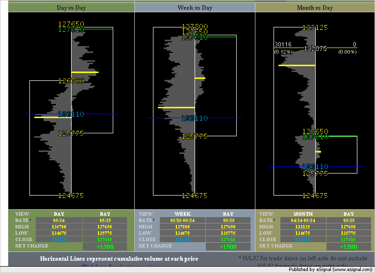
- the box represents the High-Low extremes for the time period
- the blue line shows the closing price for the previous trading DAY
- the green (or red) line shows the closing (or last) price for TODAY
I am not 100% certain as to the meaning of the YELLOW bar in the two boxes, but believe that it represents the largest volume bar (in the volume histogram) for each time period. Is this correct?
Also, I believe that the data that is collected should make it possible to calculate VWAP (volume-weighted average price), and also the median volume price (i.e. the price at the bar that includes the 50th percentile volume), as well as the quartile or 20th and 80th percentile. Do you have any plans to provide such numbers? (Or, if the raw data were available for downloading, I could contribute a spreadsheet or small Java applet to calculate those values from the data.)
Finally, I'm curious as to whether you are familiar with this methodology for other products, such as stocks, ETFs, or the new VIX futures product sponsored by the CBOE.
Again, thank you for your website!
Best regards and fortune!
First of all, thank you for chart-ex.com -- I am a student of volume-oriented technical analysis, and came across a reference to your very useful and helpful website on another trading message board. I trade options, not futures, but because several index options are hedged using futures, I find the insight about S/R levels on e-minis that provided by "Volume at Price" analysis very interesting.
I would like to confirm that my interpretation of your charts is correct. My understanding is that
- the box represents the High-Low extremes for the time period
- the blue line shows the closing price for the previous trading DAY
- the green (or red) line shows the closing (or last) price for TODAY
I am not 100% certain as to the meaning of the YELLOW bar in the two boxes, but believe that it represents the largest volume bar (in the volume histogram) for each time period. Is this correct?
Also, I believe that the data that is collected should make it possible to calculate VWAP (volume-weighted average price), and also the median volume price (i.e. the price at the bar that includes the 50th percentile volume), as well as the quartile or 20th and 80th percentile. Do you have any plans to provide such numbers? (Or, if the raw data were available for downloading, I could contribute a spreadsheet or small Java applet to calculate those values from the data.)
Finally, I'm curious as to whether you are familiar with this methodology for other products, such as stocks, ETFs, or the new VIX futures product sponsored by the CBOE.
Again, thank you for your website!
Best regards and fortune!
I'm just sticking up today's 3-combo-chart so that Lisa can use it as reference to answer your question. From what you've said I believe that you're right but I'll let Lisa confirm that.
Your request for more calculated figures presented in tabular format is a good one and I think that many traders might benefit from this information.
Click image for original size
Your request for more calculated figures presented in tabular format is a good one and I think that many traders might benefit from this information.
Thank you for your kind words.
Your initerpretation is correct on the chart display and the meaning of the Yellow bar.
I have been thinking about adding more analysis options to the chart display. Getting great feedback from users, like you, confirm my future plans.
The median volume compared to the highest volume would be a good indicator on momemntum. What do you think?
Also I was thinking of having some visual display that whould show the perimeters of the "highest" volume number above and below the close price. I think this would show the strength/weakness of the closing price.
Your insight and thoughts would be greatly appreciated!! Looking forward to you response.
Lisa Erdmier
Emini Day Trading /
Daily Notes /
Forecast /
Economic Events /
Search /
Terms and Conditions /
Disclaimer /
Books /
Online Books /
Site Map /
Contact /
Privacy Policy /
Links /
About /
Day Trading Forum /
Investment Calculators /
Pivot Point Calculator /
Market Profile Generator /
Fibonacci Calculator /
Mailing List /
Advertise Here /
Articles /
Financial Terms /
Brokers /
Software /
Holidays /
Stock Split Calendar /
Mortgage Calculator /
Donate
Copyright © 2004-2023, MyPivots. All rights reserved.
Copyright © 2004-2023, MyPivots. All rights reserved.