MP S&P Going Nowhere
Here is something that I was working on today and for some reason I decided to give it an extra twist to see if it would help me by looking at it from another angle. Here's the chart:
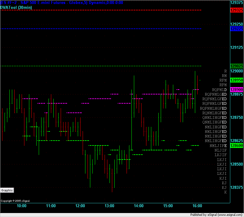
The 3 horizontal lines at the top of the chart show the Value Area High (VAH), Point of Control (POC), and VAL (from the top down) that were created on Friday. The changing fuschia and lime lines show how the developing value areas for today changed across the day.
On the right hand side of the chart is the MP graphic which has been inverted to what you normally see. As the bar chart develops to the right during the day I watch the Market Profile graphic develop towards the left - i.e. they come together. I'm trying to see if this will help my mind "get" the picture quicker and clearer.
The theory is that groups of people understand and learn things in different ways. One group of people will respond well to images, others to descriptive words, other to mathematical formulae. This is just an experiment that I am trying to see if my mind will see anything new in this form of charting that I haven't seen before.
I'm posting it here to elicit your comments to see if you see anything different here.
Emini Day Trading /
Daily Notes /
Forecast /
Economic Events /
Search /
Terms and Conditions /
Disclaimer /
Books /
Online Books /
Site Map /
Contact /
Privacy Policy /
Links /
About /
Day Trading Forum /
Investment Calculators /
Pivot Point Calculator /
Market Profile Generator /
Fibonacci Calculator /
Mailing List /
Advertise Here /
Articles /
Financial Terms /
Brokers /
Software /
Holidays /
Stock Split Calendar /
Mortgage Calculator /
Donate
Copyright © 2004-2023, MyPivots. All rights reserved.
Copyright © 2004-2023, MyPivots. All rights reserved.