Which MP numbers are the best
Hi,
I may have asked this before but which Market profile numbers are most accurate for the emini S&P ? It seems the ones you folks have here are based on time where at this site http://www.enthios.com/blog.htm they are based on actual volume....so how do we know which ones to really use? Anu clarity would be appreciated.....Example for trading Today on 10/25/2005 it looks like they had a Value area high based on their volume histogram at around 1203..and a POC of 1197.50.....but you folks didn't have the 1203 area but your value area high was close to the morning lows...can they both be correct? How many different numbers from MP do I need to watch..? Do I watch MP based on Volume or MP numbers based on time? That is the short version of my questions...Thanks
Bruce
bruce -
i'm gonna start off with a warning: my answer is gonna suck
which way to use MP is like any other indicator/system/etc. in that you can find someone successfully trading every approach. people successfully use Vol based MP. people successfully use Time based MP. people successfully trade MACD. or Stoch. or CCI. or EW. basically it becomes a matter of familiarizing yourself with market behavior within a given methodology.
i use time based MP on the minis. some traders use the bigs for data and trade the minis based on that data. i typically use the minis. i use volume as a secondary component, and a very discretionary compenent at that.
my suggestion? try each method on paper for a while. see if there is a particular approach that suits your style best or is easier/more natural for you to trade.
hope this helps. good luck.
take care
omni
I agree with omni's comments. You need to match the way that MP is calculate with your trading style and what works for you. For example, someone who is not prepared to take more than 1 point risk on any one trade will need to implement an MP trading strategy in a different way to how someone taking a 3 point risk would.
In addition to time and volume based MP calculations you can also do a trade (tick) based calculation of MP. I did some work on calculating MP using time, volume and tick and for a while published some tables using a % of total for the trading day in order to compare. Here are some old pages that may be of interest to you:
http://www.deltat1.com/DailyNotes/MPES.htm
http://www.deltat1.com/DailyNotes/MPER.htm
http://www.deltat1.com/DailyNotes/MPNQ.htm
http://www.deltat1.com/DailyNotes/MPYM.htm
Thanks to both of you for responding...it seems that Volume MP numbers give you a wider range for a Value area but the POC seems to be fairly consistent using both method....I guess the best use for Mp numbers for me would be to see a confluence of numbers from other methods (pivots, fibs...whatever) and then trade accordingly...thanks again
Bruce
So far it seems that Volume emini numbers are more accurate..I'll keep whaching
Bruce
So far it seems that Volume emini numbers are more accurate..I'll keep whaching
Confluence - I call it "cluster theory" - works well for obvious reasons. If there is a major fib number + MP number + other popular technical number then there will obviously be more traders using those methods looking for a resistance/support area there and so the crowd effect will make it a more likely turning point.
I've just thought of another way to statistically test the ability for Market Profile VAH (value area high) and VAL (value area low) as viable turning points.
You could take all days where the market opened in the mid 40% band between the VAH and VAL. i.e. At least 30% space above and below to the VAH and VAL.
Now measure the % distance that the HOD (high of day) was from the VAH and the LOD (low of day) was from the VAL. Plot those percentages as rounded numbers in a chart. This should create a bell shaped chart. The more clustered the samples are around the middle of this distribution the more likely the VAH and VAL will work as turning points for HOD and LOD when the market opens in this area.
Any comments anyone?
quote:
Originally posted by daytrader
I've just thought of another way to statistically test the ability for Market Profile VAH (value area high) and VAL (value area low) as viable turning points.
You could take all days where the market opened in the mid 40% band between the VAH and VAL. i.e. At least 30% space above and below to the VAH and VAL.
Now measure the % distance that the HOD (high of day) was from the VAH and the LOD (low of day) was from the VAL. Plot those percentages as rounded numbers in a chart. This should create a bell shaped chart. The more clustered the samples are around the middle of this distribution the more likely the VAH and VAL will work as turning points for HOD and LOD when the market opens in this area.
Any comments anyone?
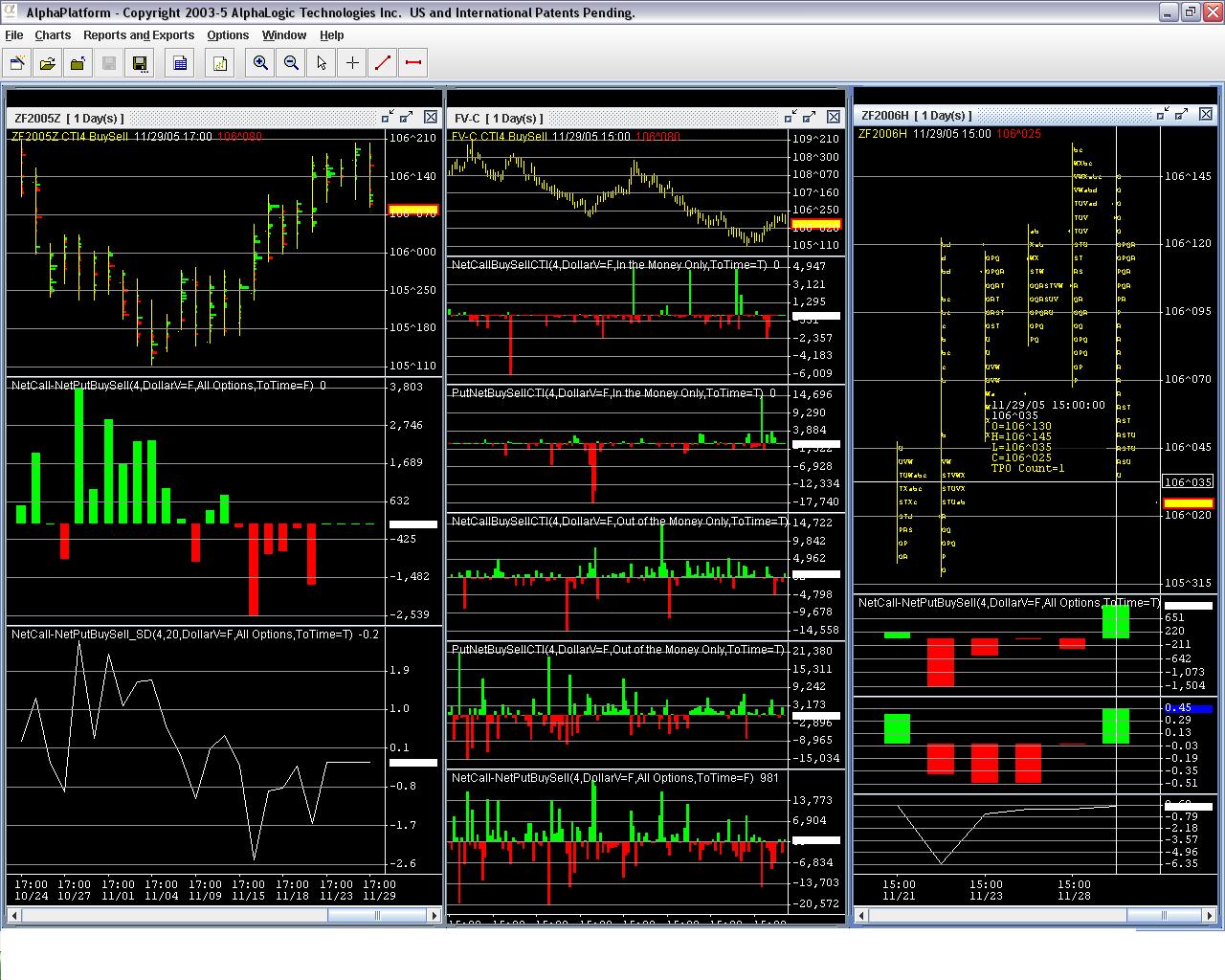
If you look at a chart with cti2 and cti4 data (or either one individually) you will notice that these volume areas ( which make up the VAh/l) become key levels for the next few timeframes. whether on the daily chart or the 120min chart (which, hopefully, I included)
Click image for original size
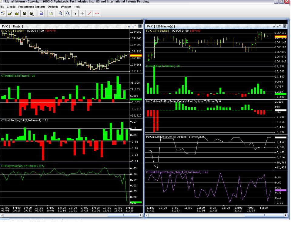
I'll give you a brief explanation of whats being shown. The left chart is the 5yr note composite contract (which includes ecbot and pit continuous). I have it setup to show cti4 net volume at price on the top chart. the gray area shows cti2 high volume area. Typically what I find is although cti2 may be a net seller on the day (typically trading against cti4 orderflow) these gray areas which are usually at the high of VA or low of VA are counter to this net volume. Meaning most of cti2 volume is buying on low or selling on high nearly everyday. The next analysis shows net cti4 actual volume for the timeframe (ie daily net of buy vol - sell vol. Notice the heavy consistent selling as the 5 yr moved towards 4.5% yield and life of contract lows of 105-11.5. Also notice how cti4 turned to a net buyer in early Nov and eventually the mkt moved higher. The 3rd analysis shows net % of total cti2 volume within the gray area I mentioned earlier. ie, yesterday 11/28, cti2 was a net seller (not on chart) however within the gray area 106-15.5 to 106-17.5 cti2 was a net buyer. The charts on the right side show 120min chart(5yr) the dashes on the price chart is net cti4 volume at price. Notice how these volume areas become support levels. Also keep in mind cti4 is typically a longer timeframe trader. I also have some cti4 data on options shown. the cti4 net call- net put buy sell analysis is a net total of synthetic long futures (buy call + sell put) minus synthetic short futures (sell call+buy put). As you can see Wed, Fri and this morning were net long trades in the options as well
Thanks oc0007, Great charts and explanation. I must admit that I read it 3 times before it fully sunk in and made sense.
For anybody else reading what oc0007 wrote give it a couple of times over if you don't get it first time.
What software do you use to produce those charts oc0007?
Also if you don't know what CTI is:
CTI = Customer Type Indicator
There are four different codes used to indicate the types of transactions that, on futures exchanges, are made by brokers on behalf of different clients and themselves.
These codes distinguish for whom and on what type of account the trades are being placed. All of this data is included in the trade register report produced by the clearing organization. These codes are known as cti1 through cti4.
Here are the four coded categories:
1. Member trades on their own accounts.
2. Clearing-member trades for proprietary accounts.
3. Member trades for other members presently upon the trading floor or for a controlled account of that member.
4. Member trades for customer accounts.
http://alphalogictechnologies.com/ has software that displays cti data in a chart format and can be exported. mdanalytics.com has a similar product. cisco-futures.com has cti data available and costs considerably less but doesnt have the same user defined gui. You can also get the data directly from the CBOT. Heres a little more detail on what cti data is http://alphalogictechnologies.com/ldb/ldb_faq.jsp. All of those sites I mentioned have some examples of how you can utilize the data in various ways. BTw, I re-read my earlier post and it can be a bit confusing. If anyone needs clarification on the data sets just let me know.
Click image for original size
Originally posted by day trading
I've just thought of another way to statistically test the ability for Market Profile VAH (value area high) and VAL (value area low) as viable turning points.
You could take all days where the market opened in the mid 40% band between the VAH and VAL. i.e. At least 30% space above and below to the VAH and VAL.
Now measure the % distance that the HOD (high of day) was from the VAH and the LOD (low of day) was from the VAL. Plot those percentages as rounded numbers in a chart. This should create a bell shaped chart. The more clustered the samples are around the middle of this distribution the more likely the VAH and VAL will work as turning points for HOD and LOD when the market opens in this area.
Any comments anyone?
Private Message:
I am going through yours and Bruce older post on Market Profile to better understand Market Profile. Following is one of your older post from 2005, wondering where you stand on this in 2011?
I still think that this is a viable theory but I never ran it against the back tester.
Emini Day Trading /
Daily Notes /
Forecast /
Economic Events /
Search /
Terms and Conditions /
Disclaimer /
Books /
Online Books /
Site Map /
Contact /
Privacy Policy /
Links /
About /
Day Trading Forum /
Investment Calculators /
Pivot Point Calculator /
Market Profile Generator /
Fibonacci Calculator /
Mailing List /
Advertise Here /
Articles /
Financial Terms /
Brokers /
Software /
Holidays /
Stock Split Calendar /
Mortgage Calculator /
Donate
Copyright © 2004-2023, MyPivots. All rights reserved.
Copyright © 2004-2023, MyPivots. All rights reserved.