New Format with Grey Background - too hard to read - sorry
The new format is very challenging to read and can't be easily printed with all the dark grey background and very small fonts
While I appreciate what you are trying to do, I prefer the old format.
I completely agree with you, I’m lost in the new format; each print might cost over $1with the dark background DT please restores the old format. Thank you
And we have much better format.
I will have to get used to navigating in new layout, but now I can read without much effort.
Thansk for reaction guys!
I will have to get used to navigating in new layout, but now I can read without much effort.
Thansk for reaction guys!
Hey guys, we listened! Feedback appreciated on the new white-based color scheme (good or bad).
It might sound contradictory to my previous post but I prefer reading the forum posts with the dark background but all the table statistics with the white background this is to save money on printing….
I prefer the old format... this is hard to read for some reason
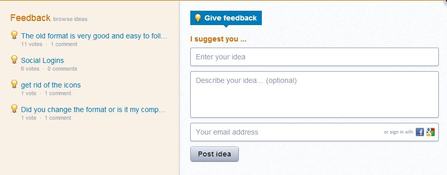
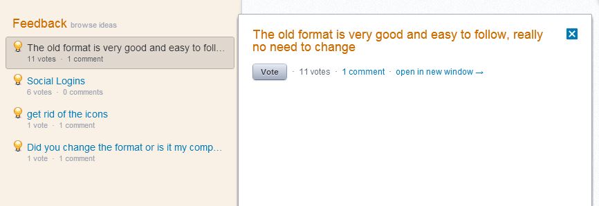
I've locked this topic. If you want to give us feedback about the site please do so by clicking on the Feedback & Support button on the right hand side of the page. This will pop-up a window that looks like this. Have a look on the left hand side of that window to see if someone has already commented on the topic that you want to comment on (lower image). If so click on that comment and you will be able to add your vote to it. The comments with the most votes get the most attention so it doesn't help if you repeat an already requested item. Thanks for your feedback, it helps us make a better site for you.
Click image for original size
Click image for original size
Emini Day Trading /
Daily Notes /
Forecast /
Economic Events /
Search /
Terms and Conditions /
Disclaimer /
Books /
Online Books /
Site Map /
Contact /
Privacy Policy /
Links /
About /
Day Trading Forum /
Investment Calculators /
Pivot Point Calculator /
Market Profile Generator /
Fibonacci Calculator /
Mailing List /
Advertise Here /
Articles /
Financial Terms /
Brokers /
Software /
Holidays /
Stock Split Calendar /
Mortgage Calculator /
Donate
Copyright © 2004-2023, MyPivots. All rights reserved.
Copyright © 2004-2023, MyPivots. All rights reserved.